

Picture your customer on Black Friday. They're on the couch, full of pie, half watching a movie, with a phone in one hand. They tap your ad, they like what they see, and they go for the button. Then a popup slides over it.
Plenty of things trip up a shopper long before the pay button, and almost all of it can be fixed before the sale.
When a store comes to us before a big sale, we first review the whole journey: the page, the account, and the user flow. Once people arrive on the page, is the journey easy, from adding to cart on to the purchase?
So for this post, we went shopping.
The solution, if you only have a minute: make your last theme, code, and app changes two weeks before Black Friday, freeze the site four days before, and leave every redesign until January.
What Did We Find When We Went Shopping?
For this blog, we walked through 7 stores on a phone, from the home page to the first checkout screen. All of them were direct-to-consumer brands that sell on values as much as on product. We purchased nothing, so we can't tell you how payment went (that one's on you!).
It's a small sample in a normal week, since most sales weren't live yet, but we'd bet your store has a few of these too.
The good news first: all 7 let us check out as a guest. Nobody made us create an account to buy socks.

Six Stores Had Already Made Up Our Minds for Us
At 4 of them, a subscription was already selected on the product page. At 2 more, a size was picked before we touched anything. We love a subscription, but the shopper should pick it.
Three Stores Greeted Us with a Popup
You know the salesperson who asks if you need help the second you walk in? That one, but on a phone. All three closed with one tap, and none got in the way of buying. Cookie banners were more stubborn: four stores gave us no one-tap way to say no.
Five Stores Changed the Total, with the Reason in a Dropdown
Between the cart and the first checkout screen, the number grew by about 7%. It was estimated taxes, which is perfectly normal, but the line explaining it was tucked inside a collapsed Order summary. So all the shopper sees is a bigger number, and extra costs are the most common reason shoppers leave a cart (1).
Almost Nobody Told Us When It Would Arrive
Only one store showed a delivery window before we typed an address, and none showed an arrival date. So anyone buying a gift in late November gets to do date math on a phone.
A few stores got this right, and they’re worth stealing like an artist (as long as you make it work for your brand). Grove told shoppers exactly when to order, in a banner at the top of the page: “Sunday 11/15 is the last day to order for Thanksgiving delivery.” Who Gives a Crap put “average delivery in 2 to 3 days” and a 30-day money-back guarantee on the product page, and Bombas put free shipping over $75 and free returns near the button.
Run the Phone Path Test before You Change Anything
Now it's your store's turn. Grab your phone and hand it to someone who didn't build the site (your mom is perfect for this). It takes just about 30 minutes, and you leave with a full view of how your customers will feel on Black Friday.
Here are the ten checks:
- Tap your own ad or email link. The offer shows on the first screen within 3 seconds.
- Read the first screen without scrolling. You can say what the offer is and when it ends.
- Find a product. It takes 3 taps or fewer.
- Open a product page. Price, reviews, and Add to Cart are within two screens, and a sticky button stays with you as you scroll.
- Check what's already chosen. No subscription is ticked, and no size is picked for you.
- Wait 15 seconds, then keep tapping. Nothing slides in, pops up, or covers a button, and you can refuse the cookie banner in one tap.
- Look for shipping, returns, and a delivery or last-order date. You find all three in under 5 seconds.
- Add to cart. The discount applies on its own or by link, with no code to retype.
- Compare the cart total with the first checkout screen. If the number changed, you can see why without opening anything.
- Check out as a guest, with a wallet button (Apple Pay, Shop Pay) and a real card, on cellular. It takes under 90 seconds. (Then refund yourself.)
If you pass all 10, you're ready. If you pass 8 or 9, fix the misses two weeks before Black Friday. Under 8, start with steps 8, 9, and 10 (they sit closest to the money), then step 6.
Your BFCM Website Checklist: What You Should Fix by November 13
Start with whatever sits between a thumb and the pay button. Adobe forecasts that phones will account for 63% of online spending from Thanksgiving through Cyber Monday (2), so the phone gets your first hours.
Say the Offer on the First Screen
Pick one offer and use the same words from the announcement bar to checkout. Send each ad and email to the exact product or collection (a homepage makes people figure out what to do next), and carry the code in the link so nobody has to retype it. Our BFCM marketing guide covers how to bring the traffic.

Let the Shopper Make the Choices
Turn the subscription off by default and show it as a clear option beside the one-time price. Leave sizes unselected. Keep one popup, delayed, and never on top of a button. In the cart, say "You're $X from free shipping," show the discount on its own line, and show the total with shipping before payment.
Give Them a Date
Put a delivery estimate in the cart and a last-order-by date wherever gifts are sold. Show sold-out sizes as sold out, so nothing vanishes from a cart at checkout, and keep your return policy one tap away.
Make It Fast the Boring Way
A hosted platform like Shopify is unlikely to go down. Slow is much more common, and the guilty party is usually something the store added itself. Leftover apps are the gym memberships of your website: you stopped using them, but their code is still loading on your pages, and your customers pay for it in load time.
Here's your afternoon, in this order:
- Audit your apps and remove the leftover code from deleted ones.
- Resize your images to the size they display.
- Remove the third-party scripts you don't need, and keep one analytics tool.
- Run one popup, delayed.
- Use a still image instead of autoplay video.
Then run PageSpeed Insights on your phone view. Don't chase a perfect score: a 60 is fine if your real visitors pass Google's Core Web Vitals. Our Core Web Vitals guide goes deeper, if you're into that sort of thing.
Earn the Trust Where They Hesitate
Show reviews with a count near the title, your return policy and shipping time on the product page, and a way to reach you at checkout. Skip "100% secure" with nothing behind it and rows of mystery seals. A B Corp mark (we have one, so we're biased) works when it links to the proof.

You don't need all nine. A store that passes steps 8 to 10 with rough edges beats one with a gorgeous banner and a cart nobody checked.
Do You Need a Countdown Timer?
Plenty of Black Friday website checklists tell you to add one. We're going to be the annoying ones here.
In October, the UK's competition regulator fined Wayfair £4.8 million and Appliances Direct £1.2 million for misleading sales tactics (3). Wayfair's "Flash Deals" had countdown timers, and many items stayed at the same price or lower after the deadline. It's Cinderella, if the carriage never turned back into a pumpkin. That was UK law (and this isn't legal advice), but it's a good definition of a fake deadline: one that passes and changes nothing.
Urgency is great when it's true. These hold up:
- A real end date and time ("Ends Monday, November 30, 11:59 pm PT").
- Real stock limits, from live inventory.
- A last-order-by date for gifts.
- A Cyber Monday bundle that truly ends.
A countdown is fine if it's counting down to one of those. If it resets for every visitor, or "only 3 left" is never true, you're better off with a plain date.
How Much Should Your Store Change for the Sale?
About 10%. A yellow-and-black Black Friday poster turns your store into a stranger, and looking nothing like Amazon is one of the best things a small store has going for it. Cover your logo and look at the page. If nobody can tell whose store it is, the sale ate the brand.
Keep your font, palette, and photography, and add one sale layer: one banner, one price treatment, one badge. Glossier puts its holiday layer into collectible packaging (limited-edition tins last December).

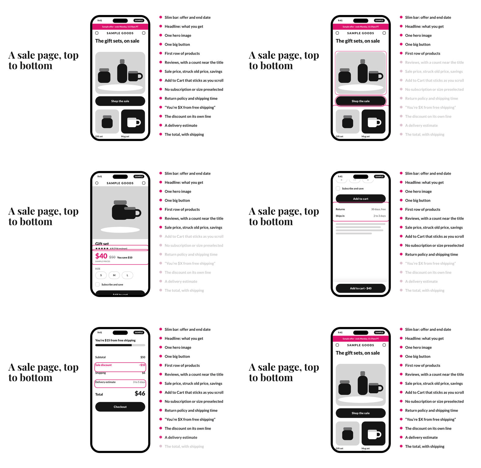
On a phone, the first screen of a sale page needs five things: a slim bar with the offer and its end date, a headline saying what you get, one hero image, one big button within thumb reach, and the first row of products peeking in. The carousel can take the week off.
For the price, make the sale price the largest, strike through the old one (a real recent price, please), and show the savings. Jonah Berger's "Rule of 100" helps with the wording (4): under $100, a percentage feels bigger, and above $100, a dollar amount does. It's a rule of thumb, so test it on your own offers.
An afternoon is enough time for a hero swap, an announcement bar, a sale badge, a gift page, and a free-shipping line. A catalog re-shoot is not. And the snow and confetti scripts can stay home (they're usually what's slowing you down).
When Should You Freeze the Site?
Don’t freeze everything at once. Look at one thing at a time, so there’s less that can break as the sale gets closer. Here’s the schedule we recommend for Black Friday 2026:

If you're reading this after November 13, skip the theme and app changes and keep every date after it. The test and the freeze matter more.
Before the freeze, write down your current conversion rate and revenue, so you have something to compare against. Then place a test order and check that your analytics, ads, and email tools all agree. In our audits, we check the user flow and the tracking together, because a broken step with no measurement looks a lot like weak demand.
And decide what you'll do on Friday morning now, while everyone's still objective:
- Checkout broken: pause paid ads first, roll back to the last theme, and don't debug live.
- Site slow: turn off the newest app or popup.
- Wrong discount: turn off the code and banner, and email the fix.
- Wallet failing: keep card payments alive and report the wallet to your platform.
Name one person with admin access, and keep your host, platform, and payment contacts handy.
What Can Wait until January?
Your redesign, your new theme, your new checkout app, your new navigation, your A/B testing tool, and your loyalty program. They're all great projects, and they're all great January projects. When you get there, our conversion rate optimization guide is a good place to start.
One thing can't wait: what happens to order two. We like Black Friday for awareness, and the more interesting question is what a first-time buyer gets next. Decide now what they'll see in December.
Who Should Skip the Sale?
Black Friday isn't for everyone (and that's fine). Skip it, or run something soft, if:
- Your site or checkout is unstable.
- You can't fulfill by the holidays.
- Your margins can't take a discount.
- Your brand is against Black Friday.
- You have no list or ad budget to bring traffic.
- Nobody can answer support.
Do the math first. At a 40% margin, 20% off means selling twice as many units to earn the same profit. A gift guide or a donation week can do the job with a lot less stress.
Walk Your Store on a Phone This Week
Run the test, fix what fails, and freeze on time. Your customer on the couch will never know how much work went into that one easy tap.
If you'd like a second pair of eyes on your store, schedule a complimentary call with our team. And once the site holds, the next job is bringing people back (starting with the ones who abandon a cart), which is why we wrote our guide to holiday email marketing for ecommerce.